Hello Internet-land, it's been awhile since I posted here. But I work on inspiration, and lately there hasn't been much of that driving any blog posts.
I've been at NI for over six years now (crazy to think I've been writing this blog for like five of those years) and think I know pretty darn well how to write effective end-user documentation. Plus, I'm human and have an ego. Put these two facts together and when I get edits on my documentation, my first instinct is to bristle and say "Hey, the way I wrote it is best!" (Unless of course it's a typo or misspelling.)
But that attitude cuts off all possibility of improvement and change, especially as we in the group put our brains together on the topic and arrive at more effective documentation strategies, and especially as we branch out into different industries with established terminologies. So even though it takes a bit of effort, as an established technical writer, to say "Here's my best work; tell me what's wrong with it!" -- that is how I want to be, both in this workplace and in life, remaining open to the possibility that there's always a better way and that I don't know what it is.
April 1, 2011

September 28, 2010
Customer's Language Redux
I've talked here before about speaking the customer's language. Yesterday I saw a post from another technical writing blog that reinforces this point. I quote:
===
....[A] user may want to send a letter to many different people. If the user doesn't know about the mail merge feature, they will insanely copy and paste all the letters.
Having an index entry of mail merge is useless, because if the user doesn't about this feature, they can't look it up! However, having these index entries could help:
Yes, these are long index entries, but so what? A good index attempts to anticipate all the strange and wonderful ways a user might look up a topic.
The mail merge topic itself has to clearly explain why doing a mail merge is better than copying and pasting, because if the user cannot see the benefit of what you are suggesting, they won't do it.
===
"strange and wonderful" ... exactly :-)
===
....[A] user may want to send a letter to many different people. If the user doesn't know about the mail merge feature, they will insanely copy and paste all the letters.
Having an index entry of mail merge is useless, because if the user doesn't about this feature, they can't look it up! However, having these index entries could help:
- distributing a letter to many recipients
- letters, sending a letter to many recipients
- mailing a letter to many recipients
- mass mailings, sending
- recipients, sending a letter to
- same letter, sending to many recipients
- sending a letter to many recipients
Yes, these are long index entries, but so what? A good index attempts to anticipate all the strange and wonderful ways a user might look up a topic.
The mail merge topic itself has to clearly explain why doing a mail merge is better than copying and pasting, because if the user cannot see the benefit of what you are suggesting, they won't do it.
===
"strange and wonderful" ... exactly :-)
July 30, 2010
Designing for your Audience
Today's xkcd (a fantastically geeky webcomic) is about designing for your audience ...
http://xkcd.com/773/
The parallels to technical writing are obvious :-) How can you know what to write if you don't know what information your audience is looking for?
http://xkcd.com/773/
The parallels to technical writing are obvious :-) How can you know what to write if you don't know what information your audience is looking for?
May 25, 2010
I Don't Want You to Think

One of my guiding principles behind writing & reviewing technical documentation is "Remove the burden of thought from the customer." After all, our customers are NOT getting paid to read documentation. They're not even getting paid to figure out how to program in LabVIEW. They are getting paid to solve problems.
So when I'm writing or reviewing technical documentation, I think to myself: how hard would a customer have to think in order to decipher this documentation? Hopefully the answer is "not very hard" because time spent deciphering the documentation is time not spent curing cancer, controlling photon beams, developing alternative-fuel technologies, monitoring structural health, and so on. But if that's not the answer I get when I look at the documentation, I have a number of ways to bring the effort level down.
- Speak your language. This one is difficult to do because the first people to define terms are the engineers who write a feature specification. As such, they define the language implicitly when talking about their feature, so because we use those specs as basis for documentation, we often repeat their language and incorporate it into headings. But we shouldn't. Compare "Using the Throughput Control" with "Achieving High Throughput". Which heading are you more likely to notice? I'd bet it's the one that speaks more to the task you want to do than the feature we are providing.
- Use pictures for visual products (like LabVIEW). Pictures improve a reader's ability to scan the text instead of requiring them to read a bunch of steps, provide anchors on the page that serve as reference points when switching back and forth between windows, and make the help look more colorful and less intimidating.
- Provide examples. Examples tell stories that can match your application, so you're more likely to notice and understand the explanation in that form. Examples also are the difference between high-level, theoretical statements like "Use the Blah API to optimize throughput when transferring data" and more low-level, specific statements, like "For example, if you are monitoring the temperature on a wireless node over a network, the BLAH API increases throughput significantly compared to the BLAH2 API. Here's why ...."
- Answer questions up front. If the LabVIEW API provides you two different ways of doing the same thing (and very often we provide more than two ways), you shouldn't have to wonder when to use a particular option. We should tell you. This issue is particularly helpful in the FPGA realm, where placing a checkmark in a single checkbox can have large timing consequences when it comes time to translate your design into hardware. At the very least, the documentation should make you aware of the trade-offs in checking that box vs. not checking that box.
- Be consistent - You'd be surprised at the amount of effort that goes into ensuring consistency among terms like "PC", "computer", "system", "machine", "console", "host", "target", "execution target", "remote execution target", and so on. This issue crops up even more in the FPGA/RT realm where you have one or more host computers connected via network to remote, embedded PXI or cRIO chassis. What the heck do you call all these things? And we still have a ways to go.
(Five points to anyone who noticed the inconsistency in how I punctuated this bullet item compared to the previous ones.) - Provide direction. At no point should you ever be wondering "What do I do next?" As Al talked about, technical writers have a number of ways in which to provide direction, both visual and textual.
These are just a few ways in which we can reduce your time spent thinking about the documentation and get you back to your task at hand. Unfortunately our ability to excel at these tasks are limited by two rather large factors:
- Lack of knowledge about what customers do, how they think, and what they want to see in documentation. This is a particular problem in the technical communications department where we have even less access to customers than general R&D. Click those feedback links, folks!! They are at the bottom of every help topic LabVIEW ships, and also for some other products:

We receive every piece of feedback and review it, even if we can't always act on it because ... - We're a for-profit company with deadlines. That's the nature of the biz, folks -- we have to ship a product on a given date and we can't always take the time to be 100% perfect in our documentation. But we can keep trying.
This post was inspired by not only thoughts I've had for the past few years, but also a post I saw about a restaurant removing the burden of thought from its customers by providing pre-calculated tips (15%, 18%, and 20%) at the bottom of each bill. The author (a tech writer) writes:
This document saves the user the grief of having to manually calculate the tip. It considers the needs of the user and immediately fulfills them, like any great document should.Exactly, man. Exactly. Instead of making tip-calculating a chore ("Let's see, divide by ten ... move the decimal over ... now multiply again by the bill amount ... wait .. where's my cell phone calculator?!") the pre-calculated tip removes the burden of thought from the customer, thus reducing the pain of this task (and reminding them to do it at the same time), thus lowering the barrier to doing the task, thus making it more likely that the customers will complete the task (in a satisfactory manner and with a minimum of pain).
Of course there are societal norms around tipping that make it likely to be done anyway, but again, the point here is that the documentation removes the burden of thought and, in doing so, actively aids the user in completing the task.
Genius. We should be so lucky to have documentation that is so comprehensive and user-focused.
March 17, 2010
Proof that UI Adds Value
At NI, technical writers often are the first non-developer users of a feature (API, dialog box, what-have-you). We are expected to notice UI issues and raise them with the developers.
The next time you defer or reject a minor UI change, consider these examples of how UI can impact your revenue:
The next time you defer or reject a minor UI change, consider these examples of how UI can impact your revenue:
February 16, 2010
Visual Help for Visual Code
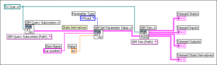
LabVIEW is a visual development language, right? That's why, many years ago, when I wrote the following about how to trim a nonlinear subsystem:
I also included a screenshot:

Many studies have been done that indicate users skim documentation, not actually reading if they can help it. I know that when I look for help in an application, I do the same thing. Enter some search terms, find a page, skim to find words I'm looking for, repeat the process if I don't find anything helpful.
Well the LabVIEW Help is not really conducive to this kind of skimming -- not when we're telling you how to complete long procedures, anyway. Here's a page from the LabVIEW 8.5 help about building shared libraries. How easy is it to follow that procedure? (I'm seriously asking, I've never followed it before ;-) My gut tells me the answer is "not very" because you have to mentally translate our words into objects you click or options you select. I think screenshots of dialog boxes, with the relevant options highlighted, would be much, much easier to skim, let alone follow.
Along similar lines, when we're talking about wiring several VIs together (like the example above) we should be showing you a minimum of one screenshot: what the finished block diagram should look like. You should be able to reconstruct the entire procedure just from using that screenshot without ever looking at the text. Maybe that's unrealistic, but you should be able to get close. Ideally we should embed all screenshots as VI snippets, as Phil points out in the comments below. Unfortunately the CHM format doesn't support dragging objects out of it, so we can't use snippets in the LabVIEW Help right now (which is kind of embarrassing, to be honest :-).
Similarly, for dialog-box heavy procedures like building a shared library, you should be able to skim our dialog box screenshots, see which options we highlight and what the settings are, and make your dialog boxes match.
The bottom line is that I feel the LabVIEW Help could use more screenshots. There are too many instances where we rely on text to describe operations can can be understood easier as screenshots. After all, we're a visual programming language, right? Yet we're not showcasing our best advantage in the help for the product itself.
As I write more LabVIEW documentation I am going to promote these ideas internally and see where they go. Maybe you'll see the results in a future version :-)
- Obtains the value of the State Derivatives parameter of the car model using the SIM Query Subsystem VI. The State Derivatives parameter contains car position, which is equivalent to the velocity of the car.
- Wires the State Derivatives parameter to the Parameters In input of the SIM Set Parameter Value VI. This VI sets the Value of car position to 60. The Parameter Type of car position is Fixed, which indicates this parameter is a condition that the SIM Trim VI must satisfy. This VI must return values of states and inputs that keep the velocity of the car at 60 mph.
- Wires the modified State Derivatives parameter to the State Derivatives input of the SIM Trim VI. This VI returns the Trimmed Inputs and Trimmed States parameters that the cruise-control system must use to maintain a velocity of 60 mph. This VI also returns the Trimmed Outputs and Trimmed State Derivatives parameters that the car model returns when the cruise-control system uses the values of the Trimmed States and Trimmed Inputs parameters.
I also included a screenshot:
Many studies have been done that indicate users skim documentation, not actually reading if they can help it. I know that when I look for help in an application, I do the same thing. Enter some search terms, find a page, skim to find words I'm looking for, repeat the process if I don't find anything helpful.
Well the LabVIEW Help is not really conducive to this kind of skimming -- not when we're telling you how to complete long procedures, anyway. Here's a page from the LabVIEW 8.5 help about building shared libraries. How easy is it to follow that procedure? (I'm seriously asking, I've never followed it before ;-) My gut tells me the answer is "not very" because you have to mentally translate our words into objects you click or options you select. I think screenshots of dialog boxes, with the relevant options highlighted, would be much, much easier to skim, let alone follow.
Along similar lines, when we're talking about wiring several VIs together (like the example above) we should be showing you a minimum of one screenshot: what the finished block diagram should look like. You should be able to reconstruct the entire procedure just from using that screenshot without ever looking at the text. Maybe that's unrealistic, but you should be able to get close. Ideally we should embed all screenshots as VI snippets, as Phil points out in the comments below. Unfortunately the CHM format doesn't support dragging objects out of it, so we can't use snippets in the LabVIEW Help right now (which is kind of embarrassing, to be honest :-).
Similarly, for dialog-box heavy procedures like building a shared library, you should be able to skim our dialog box screenshots, see which options we highlight and what the settings are, and make your dialog boxes match.
The bottom line is that I feel the LabVIEW Help could use more screenshots. There are too many instances where we rely on text to describe operations can can be understood easier as screenshots. After all, we're a visual programming language, right? Yet we're not showcasing our best advantage in the help for the product itself.
As I write more LabVIEW documentation I am going to promote these ideas internally and see where they go. Maybe you'll see the results in a future version :-)
January 19, 2010
Apologies for the Spam Comments
Apparently someone got a hold of a Chinese spam-producing software and used it to target this blog. Blogger doesn't have features for editing/deleting comments en masse, so I won't be able to remove them from the posts. Hopefully they do not interrupt your browsing experience :-)
I've turned on comment moderation for older posts and enabled some other features that should prevent such spam from occurring in the future. I guess the good part is we made it almost five years without such an attack :-)
I've turned on comment moderation for older posts and enabled some other features that should prevent such spam from occurring in the future. I guess the good part is we made it almost five years without such an attack :-)
December 16, 2009
Movement in Information: Moving toward goal-oriented documentation
Writing a great tutorial is an art form. There are several requirements for a successful how-to exercise:
- The user needs enough information to successfully complete the task.
- The user needs to move through the exercise in a reasonable amount of time.
- The user needs to learn several basic concepts that will continue to be useful outside the context of the tutorial.
A common thread in these requirements is the sense of motion. The user is moving, gaining, accomplishing and completing. Even at the end of the tutorial, the user should feel like he is still moving toward success for the real reason he accessed the documentation – to make progress on his own project or task.
It's all too easy to get bogged down in an overly-thorough exploration of concepts. You can't help every user with every possible use-case unless you're both generalized and systematic in topic coverage. In the midst of all that detail, remember that at the end of every completed documentation topic, even if it's not a tutorial, you should be able to answer the following questions:
- What tasks can the user now complete that he couldn't before?
- What is the next logical task (or tasks) that the user would like to complete using this new information?
The end of a topic can feel like you've led the user up against a wall unless you provide some logical directionality based on the answers to these questions. The flow of information can happen graphically, textually, or with user-defined input.
Graphical directionality
Who doesn't love a great flowchart? Flowcharts can show users a clear map of where the documentation can take them. It can also offer them choices based on their goals. For instance, here's a simple flowchart example from Wikipedia:

If you were using this flow chart for some technical lamp-specific documentation, the flowchart might be an image map that allowed users to click on the step that defined their problem. If the user clicks on "Bulb burned out?" you might provide a topic on how to replace a light bulb. How many technical writers does it take to write a topic about replacing a light bulb, anyway?
At National Instruments, our NI VeriStand documentation is one of our finest examples of graphical directionality and navigation. In the web version, the flowchart provides a full map of the documentation landscape and puts the navigational control in the hands of the user.

Most users skip straight to the topic of their interest. In the installed version of the help, a miniature version of the flowchart perpetuates throughout every topic in the map, providing a consistent graphical navigation experience throughout the tutorial.
Textual movement
There are specific challenges associated with creating a sense of movement in textual documentation. Sometimes it's just not possible to spend the time and resources creating a complicated flowchart or sitemap to give the user a graphical overview of your content. However, there are several tricks you can use to help the user feel like he's still moving successfully through your content.
- Add contextual identifiers based on what the user would logically do next with the information he just acquired in the current topic. Use words that imply flow, such as "Next", "Upcoming" or "Review".
- Give users the ability to skip right to the "meat" of the documentation – the part where they actually start on their own project or task. If you have a less formal documentation set, provide links such as "Fire it up now" or "Get moving". For more traditional documentation, provide a link in each topic to "Start your first project" or "Open the software environment." This gives the user a feeling of "ready when you are."
- Consider a textual navigation option for the user who lands on a topic and finds the information too basic. "Already know this concept? Maybe you want to check out the specifications for creating your own model or build a new framework." This gives a more advanced user a jumping off point from a basic topic.
User-defined paths
This might be the most complicated yet most user-focused implementation of directionality in technical communication. And we're all about the user, right? Ask him where he wants to go and what he wants to do. How can the user define his own path?
- Search
- More search
- Even more search
Your help system's search engine is the most important tool the user has at his disposal for finding the content that's relevant to his particular problem, project or task. Search is the user's way of providing his own movement through the help system, and it's the one users will choose most often. Just make sure that when he lands on results, you have some of the above tactics in place to provide him with a sense of motion as soon as he becomes engaged in a topic.
Keep on moving on
If your documentation is successful, the user will quickly move on to proficiency with your product and efficiency with his tasks. Always remember to help the user feel like you're moving him toward that goal.
- The user needs enough information to successfully complete the task.
- The user needs to move through the exercise in a reasonable amount of time.
- The user needs to learn several basic concepts that will continue to be useful outside the context of the tutorial.
A common thread in these requirements is the sense of motion. The user is moving, gaining, accomplishing and completing. Even at the end of the tutorial, the user should feel like he is still moving toward success for the real reason he accessed the documentation – to make progress on his own project or task.
It's all too easy to get bogged down in an overly-thorough exploration of concepts. You can't help every user with every possible use-case unless you're both generalized and systematic in topic coverage. In the midst of all that detail, remember that at the end of every completed documentation topic, even if it's not a tutorial, you should be able to answer the following questions:
- What tasks can the user now complete that he couldn't before?
- What is the next logical task (or tasks) that the user would like to complete using this new information?
The end of a topic can feel like you've led the user up against a wall unless you provide some logical directionality based on the answers to these questions. The flow of information can happen graphically, textually, or with user-defined input.
Graphical directionality
Who doesn't love a great flowchart? Flowcharts can show users a clear map of where the documentation can take them. It can also offer them choices based on their goals. For instance, here's a simple flowchart example from Wikipedia:
If you were using this flow chart for some technical lamp-specific documentation, the flowchart might be an image map that allowed users to click on the step that defined their problem. If the user clicks on "Bulb burned out?" you might provide a topic on how to replace a light bulb. How many technical writers does it take to write a topic about replacing a light bulb, anyway?
At National Instruments, our NI VeriStand documentation is one of our finest examples of graphical directionality and navigation. In the web version, the flowchart provides a full map of the documentation landscape and puts the navigational control in the hands of the user.
Most users skip straight to the topic of their interest. In the installed version of the help, a miniature version of the flowchart perpetuates throughout every topic in the map, providing a consistent graphical navigation experience throughout the tutorial.
Textual movement
There are specific challenges associated with creating a sense of movement in textual documentation. Sometimes it's just not possible to spend the time and resources creating a complicated flowchart or sitemap to give the user a graphical overview of your content. However, there are several tricks you can use to help the user feel like he's still moving successfully through your content.
- Add contextual identifiers based on what the user would logically do next with the information he just acquired in the current topic. Use words that imply flow, such as "Next", "Upcoming" or "Review".
- Give users the ability to skip right to the "meat" of the documentation – the part where they actually start on their own project or task. If you have a less formal documentation set, provide links such as "Fire it up now" or "Get moving". For more traditional documentation, provide a link in each topic to "Start your first project" or "Open the software environment." This gives the user a feeling of "ready when you are."
- Consider a textual navigation option for the user who lands on a topic and finds the information too basic. "Already know this concept? Maybe you want to check out the specifications for creating your own model or build a new framework." This gives a more advanced user a jumping off point from a basic topic.
User-defined paths
This might be the most complicated yet most user-focused implementation of directionality in technical communication. And we're all about the user, right? Ask him where he wants to go and what he wants to do. How can the user define his own path?
- Search
- More search
- Even more search
Your help system's search engine is the most important tool the user has at his disposal for finding the content that's relevant to his particular problem, project or task. Search is the user's way of providing his own movement through the help system, and it's the one users will choose most often. Just make sure that when he lands on results, you have some of the above tactics in place to provide him with a sense of motion as soon as he becomes engaged in a topic.
Keep on moving on
If your documentation is successful, the user will quickly move on to proficiency with your product and efficiency with his tasks. Always remember to help the user feel like you're moving him toward that goal.
#2 With a Bullet
Hope ya’ll don’t mind a little horn-tooting!
In a Glassdoor.com survey, NI’s been named the second-best tech company to work for, coming in behind Juniper at #1 and Google at #3!
Can’t say I’m surprised :-)
If you look at the site’s overall company ratings, we come in at #13, just behind Kraft. If only we had the power of mac & cheese, we’d be better than they are, I know it …
December 8, 2009
The War on Error
Funny post from Andrew Brooke, a new blog I’ve added to my RSS feed.
The troop surge represents a 43% increase in the number of soldiers. Can you imagine the effect if a company increased the number of its tech writers the same amount? It would annihilate much of the company's misinformation and missing information, a victory in war on error.
December 3, 2009
Camel Case & Linux Documentation
A couple tidbits for ya today:
- LabVIEW, VeriStand, FieldPoint, CompactRIO, iPhone – what do they all have in common? Their product names use camel case. (h/t to DF)
- The sorry state of Linux documentation; from a user’s viewpoint.
October 30, 2009
Halloween Demo Day

It’s a tradition: Every year on Halloween (or as close to it as the work week will allow), tons of LabVIEW developers set up shop at their desks and demonstrate features or products they’ve been working on to all comers. The email goes out to the entire company (in Austin, anyway) and for two hours, (most) work stops as people come by to check out what we’ve been working on.
Today’s that day! I just spent the past half hour blowing up balloons and attaching them w/ribbons to bowls of candy that will go at each demo station. I’ll post pictures or videos if I get them, later.
October 26, 2009
Preview of LabVIEW 1.0, 1986
In the comments on my last post, Yair pointed me towards this preview of the LabVIEW 1.0 beta, all the way back in 1986. Enjoy!
Interesting Articles
- Here’s a review of the original Macintosh, done in 1984. It’s amazing to read this now with 25 years of perspective and realize both how different it was and how similarly things still work today. But even back then some people seemed to “get it”.
When LabVIEW was first released in 1986, it was for the Mac, because that was the dominant graphical platform of the day, and LabVIEW is and has always been a graphical language. Makes sense to me. (We actually have a couple LabVIEW R&D members who’ve been around since version 1.0 – if you came to NIWeek in 2006, you saw them present onstage.) It wasn’t until 1992 that the first Windows version appeared. - Learn information better by getting it wrong first. This is an interesting idea, and it makes sense to me. Answers are always better when they come from within. Here in LV R&D we encourage tech writers to find answers to their problems (given the proper resources) before asking others for help. This often involves getting it wrong. But even outwardly, I employed this concept when I designed the Statechart Module Getting Started tutorial. How? I instructed users to build a broken statechart – and then try and run it. The idea is that the resulting error would serve as a sort of opposite-approach to good statechart design – e.g., here’s what not to do. It also gets users familiar with the error-reporting mechanism in the software and one of the key rules of statechart development.
I guess the challenge is that if you fail too much it becomes frustrating and demotivating, so there’s a fine line to walk. We certainly don’t make a habit of publishing documentation that leads to failure :-)
October 23, 2009
Interesting Articles
I find myself reading a lot of tech news sites. I sometimes email these links out to developers or other technical writers if they are interesting or have applications to LabVIEW/NI, but I figured, why not share them with the world?
Here's are a few things I came across lately:
Here's are a few things I came across lately:
- Don't offer preferences to users if you don't have to. I think about this sometimes as we design software here ... oftentimes I'll hear developers arguing over how a feature should work and I'll think "just make it a user preference." But recently I'm starting to feel like users can get overwhelmed by ginormous, scrolling Options dialog boxes. (Not to name any names, haha.) Similar to BBEdit mentioned in the article, the version of Lotus Notes we use at NI has a type-ahead filter in its preferences dialog ... so you can search for preferences among its ginormous list.
I'd bet that a Jeff Foxworthy might say ... if you have to improve usability by letting users search through your list of preferences, you're probably giving users too many preferences. And I imagine that once you give users preferences, you can't remove those preferences in future versions. Because that ruins their editing experience that they've customized. Much better to not give the option in the first place and make an intelligently-informed decision about the behavior. - Users don't read -- or, they read the absolute minimum. This is a running joke in our department. And by "joke" I mean "concern". Does anyone actually read our documentation? I think many technical writers have this concern. And I think the answer is "not unless necessary." Personally, that doesn't stop me from putting my best efforts into shipping quality documentation. But it does mean we have to keep things in perspective. Although we support and provide polish for the software, we are not the software. That should be priority #1.
- The science of irrational behavior. I find this article fascinating -- might have to pick up the book. I can this playing out when we determine ship dates -- but really, just about anything (a co-worker mentioned this behavior coming into play when determining how much to sell a TV for). The first person to make a guess sets the tone for the rest of the discussion. The Slashdot commentary on this article led me to learn about Planning poker, which is a) hilarious and b) really, really interesting. (If we do this at NI, I certainly don't see it.)
- Ubuntu's first bug. This makes some of our issues look rather trivial ...
October 13, 2009
Leica & LabVIEW
Leica makes some of the highest-quality, precision-engineered cameras in the world. WIRED magazine recently caught up with them and took a tour of their facility in Solms, Germany. In one of the shots, you can see a LabVIEW application (designed by Ramitek GmbH) being used to test the M9, Leica's newest camera. It's kind of awesome to see LabVIEW being used to help control tolerances as fine as 0.0001 mm. That is tiny!!
DPreview.com did a similar tour back in August, and some LAVA forum members noticed additional screenshots of our software in use.

DPreview.com did a similar tour back in August, and some LAVA forum members noticed additional screenshots of our software in use.


September 17, 2009
Speaking the Customer's Language
Small bit of background: I recently got (more) into digital photography and have been having a fun time dreaming of buying fancy-schmancy camera lenses. So I was checking out Sigma's web site and saw they have an "advisor tool". I clicked it and was presented with this:


This tool is of absolutely no use to me. Why? Because I don't think in terms of "Lens technology" or even "Weight". I think in terms of "I want to take awesome pictures of bands at concerts without having to wander through the mosh pit." or "I want to take awesome pictures of friends at house parties where I'm typically like 3-4 feet from my subject". Those are the first things I think about. Not whether I want "APO" or "DG" (whatever the heck those mean) technology, or whether my lens needs 7 or 12 groups, or even weight. Weight's definitely a factor, but that only helps me filter down my choices. It's not where I want to start out.
Here's my thought: pro/advanced customers will not use this advisor because they already know what lens they want to buy; they can just Google it to find more info, a review, or a price. They think in terms of "Okay, I need a lens that hits 200mm at f5.6." They don't need a wizard for that; they've got Google or their local photography store. And if they did need a advisor for that (to find out what Sigma offers in those categories), this one certainly won't do the trick.
The advisor's geared more towards beginners and semi-beginners like me who don't even know what's out there to match their needs, and we certainly aren't experts at terminologies like focal length and aperture size. And if that's the case, then this wizard doesn't speak our language, which means using it will frustrate me, and I'm more likely to try my hand at discussion forums or asking a friend, any of which might lead me away from Sigma.
I had a similar camera-related issue a few weeks ago. Setup: I know there's some camera-flash mode out there where you can fire the flash at the endof an exposure, rather than at the beginning. I have heard this is called "rear-curtain sync". I looked through my Canon Rebel XSi's manual for this term but did not find it, so I assumed that the built-in flash does not have this capability.
Wrong. It does. It turns out that Canon calls this capability "second-curtain sync". Why? No idea; perhaps they want to be distinct from Nikon and/or other camera manufacturers. But since I didn't know how Canon thought of it, I didn't know what terms to search for. So I didn't find the information I was looking for. Maybe this is beneficial to Canon because they can sell upgrades (Speedlite add-ons) easier if customers think their built-in flash doesn't perform as well. I really hope that's not the case, but you never know :-)
This issue comes into play in documentation. You have to think like a user and talk like them also. If you do that, search hits will come up and index entries will be informative, and users will find the information that they're looking for. And that's what we all want :-) This is especially true of topic headings, which are displayed more prominently in topics. That's why I named this topic the way I did. I called it "Specifying the State in a Region that Executes First" because I imagined that would be the question the user has in their mind: "I have a state in a region; now how do I make sure that this state executes first?"
I could have called it "Using the Initial Pseudostate" and been done with it. But who the heck knows, out of the box, what an Initial pseudostate is? (Outside of the development team, I mean.) I feel that because I used a task-based heading, users are more able to find the information they're looking for. It's not always easy and it doesn't always work, but I feel that results in higher-quality documentation and a more positive experience for customers.
What products or help files have you run across that speak your language?
August 7, 2009
NI Week: Where NI Technology Gets Real
As NI's newest tech writer, I feel like it's part of my job to experience as much of our technology as possible. In my day to day work, I can do this by talking with developers about the product and learning from them about how the customer might use the new features they're working on. Sometimes I get the chance to see a demo, but it's rare that I get to see the end result from a customer's application.
As I entered the Austin Convention Center on Tuesday morning, there was a lot of energy in the (chilly, air-conditioned) hall. People were flooding up the escalators to get a good seat for the morning's keynote with Dr. T. It was truly amazing to see the community of engineers who are so passionate about their work and about the technology. Dr. T's talk was fantastic, as were the keynotes from the other speakers. What really fascinated me, though, was the multitude of demos set up on the stage each morning.
We got to see robots climb stairs and see a robotic arm offer up a first aid kit with excellent comic timing. We even got to hear the Star Wars theme played on a laser harp:
Each demo showed the amazing range of applications where NI technology can be utilized. On the third morning, the demos highlighted socially responsible uses for engineering innovation, and groups presented their vision of a better future. Mashavu demonstrated their networked health solutions designed to make it easier for people in 3rd world countries to get in contact with a medical professional. Envirofit, born out of CSU's Engines and Energy Conversion Laboratory, showed off their low-cost cook stove that eliminates much of the dangerous pollution associated with traditional cooking methods in developing countries.
For me, NI Week not only showed how the products I write for become tangible systems, but also showed how my work and the work of our developers and engineers can be connected to the rest of the world. At NI Week, I got to really see our technology come alive. Sometimes it can be easy to lose sight of that big picture, so I was grateful for the opportunity to reconnect.
As I entered the Austin Convention Center on Tuesday morning, there was a lot of energy in the (chilly, air-conditioned) hall. People were flooding up the escalators to get a good seat for the morning's keynote with Dr. T. It was truly amazing to see the community of engineers who are so passionate about their work and about the technology. Dr. T's talk was fantastic, as were the keynotes from the other speakers. What really fascinated me, though, was the multitude of demos set up on the stage each morning.
We got to see robots climb stairs and see a robotic arm offer up a first aid kit with excellent comic timing. We even got to hear the Star Wars theme played on a laser harp:
Each demo showed the amazing range of applications where NI technology can be utilized. On the third morning, the demos highlighted socially responsible uses for engineering innovation, and groups presented their vision of a better future. Mashavu demonstrated their networked health solutions designed to make it easier for people in 3rd world countries to get in contact with a medical professional. Envirofit, born out of CSU's Engines and Energy Conversion Laboratory, showed off their low-cost cook stove that eliminates much of the dangerous pollution associated with traditional cooking methods in developing countries.
For me, NI Week not only showed how the products I write for become tangible systems, but also showed how my work and the work of our developers and engineers can be connected to the rest of the world. At NI Week, I got to really see our technology come alive. Sometimes it can be easy to lose sight of that big picture, so I was grateful for the opportunity to reconnect.
Web LabVIEW UI Builder - Doing Something New with the Help
 Wednesday at NIWeek, we took the wraps off of the newest project I've been working on - a way to host LabVIEW in a Web browser, letting you build VIs without installing ANYTHING on your computer (ok, that's not the whole truth, you DO need to spend 30 seconds downloading the Silverlight runtime engine!) Just like Gmail, Google Docs, et al let you access email and spreadsheets without installing ANYTHING on your computer except a Web browser and a few standard plug-ins.
Our model allows you to build thin client VIs -- VIs whose front panels serve up UIs in a Web browser (w/Silverlight installed) and whose block diagrams connect to Web services, running on a remote cRIO/PXI/whatever target, that exchange data with a device you want to control and/or monitor. Up until now you've had to build these UIs in Flash, Flex, AJAX, or whatever. Pretty soon you'll be able to do it using just G! Yes, one language to rule them all ...
After you deploy this VI, you'll get a special URL for it. You then can connect to it anytime you want to view data from/send data to the device (in our keynote example, we used a wind turbine). The key is that you DON'T NEED LabVIEW INSTALLED to connect to this VI and control/monitor the device! You just need a Web browser/OS combo that Silverlight supports.
(Wow, I'm actually getting into a draft of a help topic here!)
I'm the technical writer for this project and it's something that's been very exciting to work on for the past few months. The main reason is that in planning the help system, we are going to be doing some very cool things. Granted they won't be mind-shattering, but given NI's traditional reliance on installing/printing CHMs and PDFs for help topics, the Web LabVIEW UI Builder (WLVUIB ... uh ... no) help will be pretty slick. For example I hope to reduce the time it takes to update the help, and I also hope to shrink the distance between developers/tech writers and users by taking advantage of some community-focused features. After all, you know best how to use these products. You should be able to share that knowledge easily with other users and with NI if you so choose. It's a win-win.
I also hope to bring videos, tags, and RSS into the mix. The overall experience should be more interactive than an installed CHM/PDF file, while still enabling you to find the information you need in order to get your job done.
Not that you'd sign up to use this product solely for the help, but if you participate in the pioneer, you'll get a sneak peek at it, of course! If you're interested in being a part of the pioneer program for Web LV UI Builder or any of the other few pioneer programs we have going on, head over to ni.com/day2 and let us know.
August 3, 2009
The LabVIEW 2009 Help

Bet you didn't know we have so many LabVIEW add-ons! Did you know we make a toolkit to help you develop adaptive filter algorithms? (You know, like if you wanted to create some noise-cancellation headphones.) Or that we have software to help you validate your code with unit testing? And that's not even counting the add-ons that let you run LabVIEW in real time or on the Windows Mobile OS.
No, I swear I haven't joined the marketing team. I just think back to all the work we put into these help systems and feel really good seeing them online like this for public consumption :-)
Our online presentation is not the most sophisticated way to do things. You can see that we throw our stuff up there as static HTML pages. In this day and age of content management systems, having a collection of documents linked together just with hyperlinks seems pretty outdated. It's a travesty, I tells ya! Fortunately there are people at NI who realize this. I hope one day we can implement something a little more modern -- and that it won't be outdated if/when we roll that system out :-)
Subscribe to:
Posts (Atom)