- The user needs enough information to successfully complete the task.
- The user needs to move through the exercise in a reasonable amount of time.
- The user needs to learn several basic concepts that will continue to be useful outside the context of the tutorial.
A common thread in these requirements is the sense of motion. The user is moving, gaining, accomplishing and completing. Even at the end of the tutorial, the user should feel like he is still moving toward success for the real reason he accessed the documentation – to make progress on his own project or task.
It's all too easy to get bogged down in an overly-thorough exploration of concepts. You can't help every user with every possible use-case unless you're both generalized and systematic in topic coverage. In the midst of all that detail, remember that at the end of every completed documentation topic, even if it's not a tutorial, you should be able to answer the following questions:
- What tasks can the user now complete that he couldn't before?
- What is the next logical task (or tasks) that the user would like to complete using this new information?
The end of a topic can feel like you've led the user up against a wall unless you provide some logical directionality based on the answers to these questions. The flow of information can happen graphically, textually, or with user-defined input.
Graphical directionality
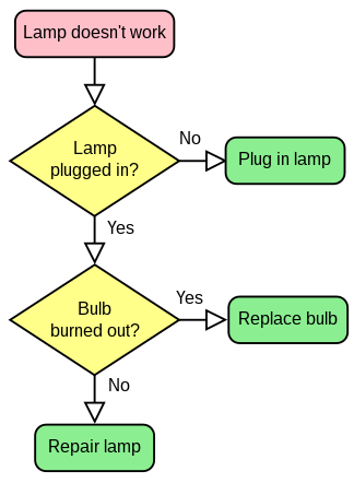
Who doesn't love a great flowchart? Flowcharts can show users a clear map of where the documentation can take them. It can also offer them choices based on their goals. For instance, here's a simple flowchart example from Wikipedia:

If you were using this flow chart for some technical lamp-specific documentation, the flowchart might be an image map that allowed users to click on the step that defined their problem. If the user clicks on "Bulb burned out?" you might provide a topic on how to replace a light bulb. How many technical writers does it take to write a topic about replacing a light bulb, anyway?
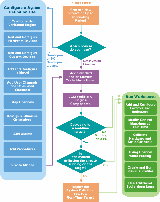
At National Instruments, our NI VeriStand documentation is one of our finest examples of graphical directionality and navigation. In the web version, the flowchart provides a full map of the documentation landscape and puts the navigational control in the hands of the user.

Most users skip straight to the topic of their interest. In the installed version of the help, a miniature version of the flowchart perpetuates throughout every topic in the map, providing a consistent graphical navigation experience throughout the tutorial.
Textual movement
There are specific challenges associated with creating a sense of movement in textual documentation. Sometimes it's just not possible to spend the time and resources creating a complicated flowchart or sitemap to give the user a graphical overview of your content. However, there are several tricks you can use to help the user feel like he's still moving successfully through your content.
- Add contextual identifiers based on what the user would logically do next with the information he just acquired in the current topic. Use words that imply flow, such as "Next", "Upcoming" or "Review".
- Give users the ability to skip right to the "meat" of the documentation – the part where they actually start on their own project or task. If you have a less formal documentation set, provide links such as "Fire it up now" or "Get moving". For more traditional documentation, provide a link in each topic to "Start your first project" or "Open the software environment." This gives the user a feeling of "ready when you are."
- Consider a textual navigation option for the user who lands on a topic and finds the information too basic. "Already know this concept? Maybe you want to check out the specifications for creating your own model or build a new framework." This gives a more advanced user a jumping off point from a basic topic.
User-defined paths
This might be the most complicated yet most user-focused implementation of directionality in technical communication. And we're all about the user, right? Ask him where he wants to go and what he wants to do. How can the user define his own path?
- Search
- More search
- Even more search
Your help system's search engine is the most important tool the user has at his disposal for finding the content that's relevant to his particular problem, project or task. Search is the user's way of providing his own movement through the help system, and it's the one users will choose most often. Just make sure that when he lands on results, you have some of the above tactics in place to provide him with a sense of motion as soon as he becomes engaged in a topic.
Keep on moving on
If your documentation is successful, the user will quickly move on to proficiency with your product and efficiency with his tasks. Always remember to help the user feel like you're moving him toward that goal.
This comment has been removed by a blog administrator.
ReplyDelete